


The US Debt Crisis: Explained
A detailed analysis and visualization of the buildup in US public and private sector debt.

Like nearly all other developed nations, the United States is facing a severe debt problem.
Today, public debt is nearly $35 trillion, rising approximately 23% in the last four years alone.
But public debt only tells one half of the entire story: what the government owes.
The United States also has $66 trillion of private debt - what companies and households owe.
So, in this article, we’ll not only break apart the debt situation in the public sector, but we’ll also analyze the private sector debt burden. At the end of this article, we’ll discuss the consequences of such a crushing public and private debt burden.

From 1955 through 1980, total debt averaged 150% of GDP, but that has more than doubled over the last 40 years.

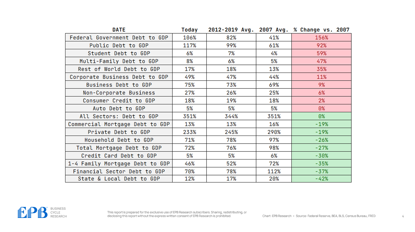
For all sectors of the economy, we’re going to look at the debt levels today, the debt levels in 2007 before the last major debt crisis, and the average debt level from 2012 to 2019 to get an idea of whether the economy or a particular sector is at significant risk.
For example, if we look at the first line in the chart below, we can see that federal government debt is 106% of GDP today. It averaged 82% from 2012 through 2019 and 41% in 2007. Compared to 2007, debt to GDP has increased 156%, a massive increase in the federal government's debt burden.
We will go through a process like this for each layer of debt to uncover the biggest issues facing the US economy today.
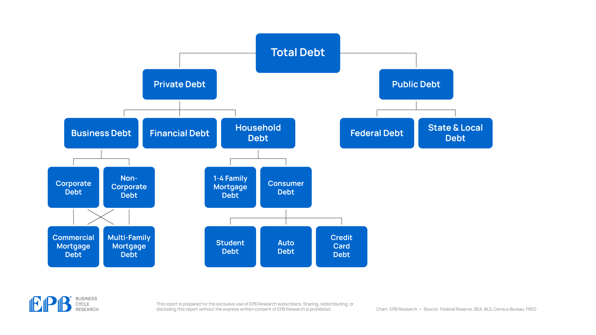
Let’s start by looking at total debt to GDP, which includes all sectors of the economy, both the private sector and the government sector.
The economy has a total debt to GDP ratio of 351%. This compares to an average of 344% from 2012 to 2019 and 351% in 2007. So the economy, as a whole, has not deleveraged at all from the 2007 crisis and the years that followed.
There’s a massive build-up of debt that’s crushing the average American, leading to weaker economic prospects as there was no net reduction in debt.

If we go one layer deeper, and we analyze private sector debt and government sector debt, we can see some changes.
The private sector which includes the business sector, household sector and financial sector, has a total debt to GDP level of 233% compared to an average of 245% from 2012 to 2019 and 290% in 2007.
So, the private sector has reduced its debt burden, but on the flip side, the government sector has 117% debt to GDP, an increase from 99% from 2012 to 2019 and 61% in 2007.

So there was no net reduction in debt burden across the entire economy, we simply shifted debt from the private sector balance sheet to the government balance sheet, keeping aggregate debt levels almost exactly the same.
Let’s dig one layer deeper, starting with public debt, which is comprised of the federal government and the state & local governments.

So we know the total government sector has massively increased debt over the last several years, up to a total of 117% of GDP as of the start of 2024.
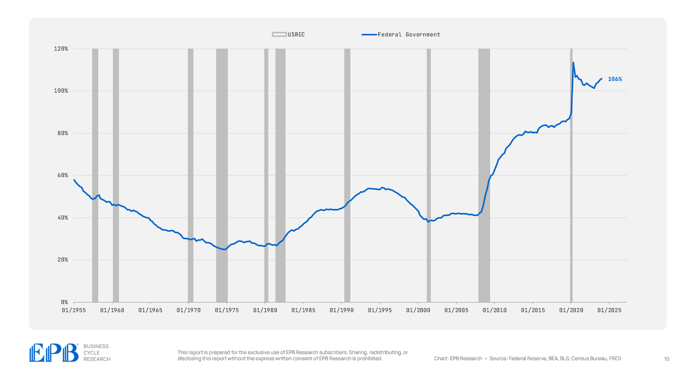
Almost all of this debt is being driven by the federal government, which has a debt burden of 106% to start 2024, compared to an average of just 41% in 2007.
The state and local government debt burden has actually decreased quite dramatically, falling to just 12%.
Now, this does not mean state and local governments are being more fiscally responsible; rather, we are just rolling the debt up to the federal sector by the federal government providing support to state and local governments.

We are concentrating more debt or spending at the federal level.
In 2007, roughly 65% of government debt was federal debt. Today, almost 90% of government debt is federal debt.

So not only are we shifting debt from the private sector to the public sector, we are rolling all the debt upwards to the federal government balance sheet.
So as we keep referencing this debt map, we can mark where the debt buildup is. We haven’t reduced total debt at all since 2007, but we’ve shifted debt to the public sector and more specifically to the federal government.

Let’s now move to the private sector and look at the three major sectors: the business sector, the financial sector, and the household sector. The aggregate private sector is in better shape than in 2007, but there are absolutely troubled pockets.
The business sector, which includes corporate and noncorporate businesses, currently holds a debt level equal to 75% of GDP, more than the 73% averaged from 2012 to 2019 and the 69% averaged in 2007. So, the overall business sector remains highly leveraged.

The financial sector was one of the major sources of trouble in the 2007 crisis, with average debt levels equal to 112% of GDP compared to 70% today. So the financial sector deleveraged in a big way.

The household sector also deleveraged with a debt level of 71% of GDP today compared to almost 100% in 2007.

So the whole private sector deleveraged while the public sector massively increased leverage.
Within the private sector, the financial sector and household sector reduced debt while the business sector maintains a very highly leveraged position.
Let’s now move one layer deeper within the business and household sectors.

The business sector is made up of corporate and non-corporate businesses.
There’s no material difference between the corporate and non-corporate sectors – both have maintained a highly leveraged position. The corporate sector has a debt level of 49% of GDP compared to 44% in 2007.
The non-corporate business sector has a debt level of 27% of GDP today compared to 25% in 2007.


So, within the business sector, which is holding one of the highest debt burdens of all time, both the corporate and non-corporate sectors are contributing to the lack of deleveraging.
Household debt is made of two major categories, mortgage debt and consumer debt.

Let’s take a look at the fourth layer of our debt map for the household sector.
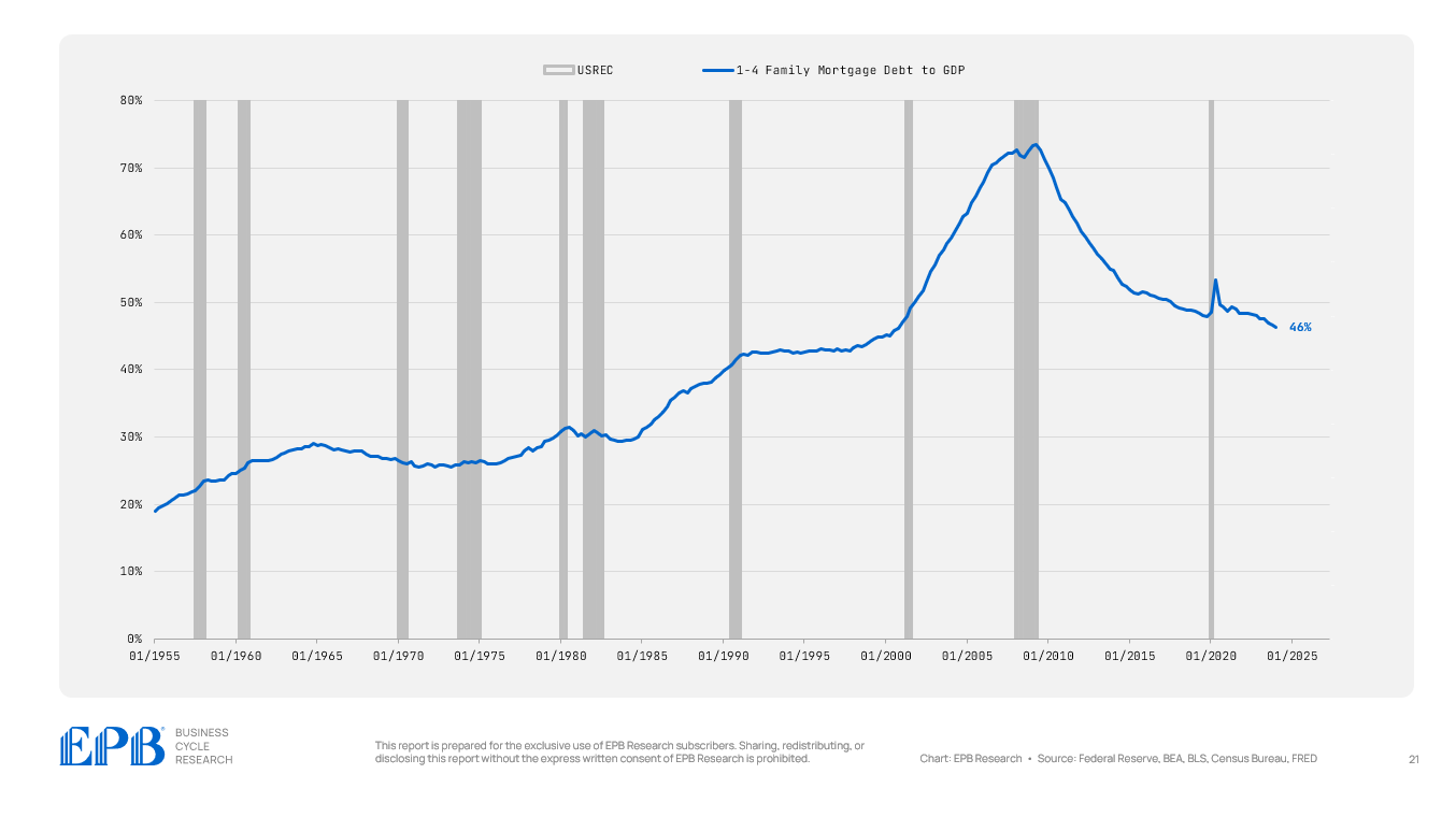
Mortgage debt has been dramatically reduced in the household sector, falling from 72% of GDP in 2007 to 52% in the 2012 to 2019 period to 46% today.
The household sector massively reduced mortgage debt.
Consumer debt, on the other hand, which is student loans, auto loans, and credit card loans, is 18% today compared to virtually the same level in 2007 and the average from 2012 to 2019.

So what’s happened in the household sector is mortgage debt dropped sharply and consumer debt remained very elevated.
Wealthier households have more mortgage debt, and lower-income households have more consumer debt. So wealthier households have likely deleveraged but lower income households remain under an extremely high level of consumer debt.
Let’s now move to the fifth layer in our chart and look at the business sector which holds both commercial mortgage debt and multi-family mortgage debt.
Commercial and multi-family debt are held by both the corporate and noncorporate sectors generally.

Commercial mortgage debt has declined in recent years, averaging 16% of GDP in 2007 compared to 13% today.

Multi-family debt, however, has been one of the most aggressive run-ups of any sector so far.
Multi-family mortgage debt fueled a huge overbuilding of apartments with debt in the sector now at 8% of GDP compared to 5% in 2007. The current level of multi-family mortgage debt is the highest level in history for the United States.
This is clearly one of the problem areas for this economic cycle, as some people will be holding multi-family debt against overbuilt properties that were not good investments.

So we now know that within the business sector, multi-family debt is one of the problem areas, and it’s held by both corporate and noncorporate businesses, as well as smaller segments of the financial sector like regional banks.
Let’s wrap up by looking at the fifth layer of our debt map but for the household sector which are the three major segments of consumer debt.

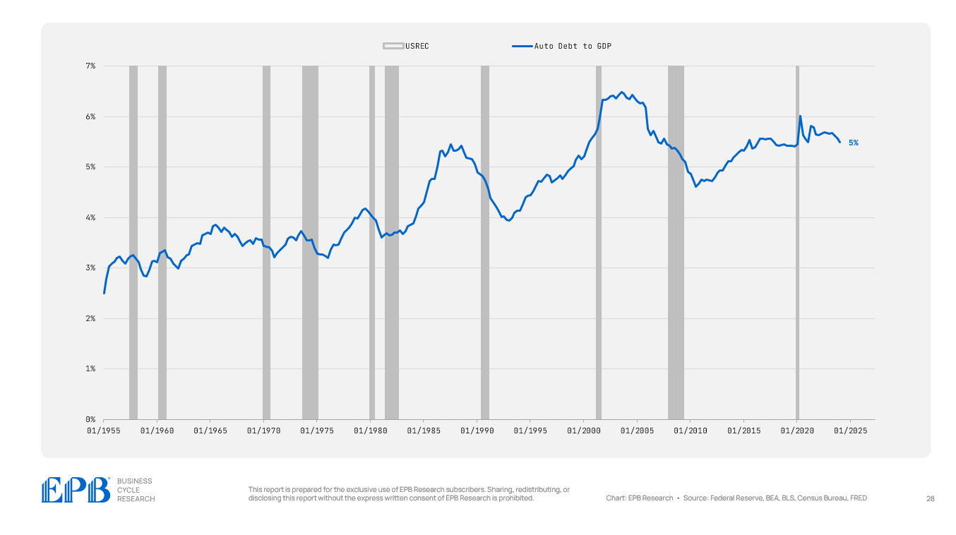
As a percentage of GDP, credit card debt has declined since the 2007 period, but auto debt has remained at very elevated levels, holding around 5% of GDP.

Student debt has exploded over the last 20 years, but it has declined after the pandemic, now at 6% of GDP.

So when we visual the entire US debt map, and break it into five layers, we can identify the problems areas and the likely source of public and private sector stress.
The total US debt situation remains just as unmanageable as 2007, or the pre-pandemic period.

The private sector as a whole is in much better share than it has been over the last 20 years on average but the public sector is in far worse share with an increasing share of that debt burden, which up to 90%, has shifted specifically to the federal government.
Within the private sector, there are some pockets of increased debt burden. The corporate and noncorporate sector have a high level of multi-family apartment mortgage debt. There was huge overbuilding in multi-family apartments over the last 10-15 years and it’s clear that some of this multi-family mortgage debt is bad debt that will cause losses. There is always bad debt when leverage increases rapidly.
The household sector has a lower debt burden compared to the last 20 years but it’s all from a reduction in mortgage debt. Consumer debt burdens remain just as high as ever in the last 20 years, with student loans and auto loans being the biggest culprits.
Higher government debt, will continue to reduce the standard of living for the average American and within the private sector, we should be most focused on the buildup of debt within the multi-family sector, mostly owned by regional banks and private equity funds.
If you enjoyed this post, please share it and subscribe to receive regular posts on the US economy, just like this one!
Please visit our About Page to learn more about EPB Research and the regular content to expect from this Substack.
Obviously you have invested considerable time and skills in the latest Substack. Thank you.
I have two largish questions for you.
First, I wonder if you have data and conclusions already collected for an general analysis of correlation between developed nations' mandatory government spending (vs. discretionary spending), those nations' income crises (or lack thereof), and those nations' approaching population crises. If you do, I'd be interested to read your conclusions (quick conclusions, since it likely diverges to a side topic for you).
I think back to your article "America's Income Crisis: How It's Triggering a Collapse in Birth Rates" and your past video about approaching population crises across developed nations / regions, and I would be unsurprised to see correlations, especially in nations or regions in which home ownership rates and land available for development are comparable to US and China.
Second, I'm curious about potential economic effects of a widening of the "wealth gap" between low- and middle-income families--especially if government mandatory spending continues to increase in its share of the federal budget--and further-order effects on issues such as the population and income crises.
To provide context, recent US inflation without comparable increases in employment income has really slammed lower-income families in several, somewhat co-recursive ways, such as
(1) Lower-income families generally rent their homes, whereas much of the middle-income population attains home ownership at some point in their adult lives. Inflation increases the cost of maintaining property and, therefore, passes on to tenants by means of rent increases. Since inflation has recently outpaced increases in wages and salaries by a large amount, lower-income families have fallen into further economic trouble (perhaps triggering increases in government spending for them). On the flip side, property-owning families have seen less economic impact since their mortgage payments will have remained mostly flat, technically becoming easier to afford as inflation progresses.
(2) Lower-income families--especially those desperate for immediate financial assistance--are more likely to take on higher-rate debt. Throughout this period of inflation, the required income and asset level to maintain credit worthiness has also increased, even though income rates themselves have not increased at the same amount. Lower credit worthiness forces lower-income families to borrow at higher interest rates (on top of the rate increases banks have already applied in order to counter high inflation levels). Obviously, the effect on lower-income families is a depression on the growth of their wealth over time, extending the time that they will be in economic duress and, in some cases, reliant on government assistance (perhaps, again, increasing the amount of federal mandatory spending and extending that portion of the spending by several years). In the worst case, lower-income families simply lack the requisite credit worthiness and monthly income for any leverage and become massively dependent on government assistance. On the flip side, homeowners' assets generally increase in value with inflation (not considering other market effects) and serve to maintain credit worthiness (or to improve it over the course of a mortgage, as equity increases). Again, this leads to more depression of lower-income households versus stability or even lift for home-owning households.
Given the previous two bullets, the effect of public (federal government) debt on the drop in real personal income gains would seem to be an increasingly self-reinforcing mechanism as the economic gap between middle-income and lower-income households widens.
You explained very well the prospects and intertwined causes of high federal mandatory spending, high federal debt, declining real income gains, and declining birthrates within the context of the current US household economic situation. First, do you see a widening gap between the economic situations of middle- and low-income households? If so, do you see the gap acting as an amplifying feedback loop on the issues I just mentioned--that is, do you see the gap significantly affecting the math, so to speak, in your analyses as the gap widens or has widened year by year? Lastly, if you've happened to look at relevant data, are you able to form a general conclusion on whether the potential "widening wealth-gap amplification issue" is a uniquely US problem or appears in other, comparable developed nations?
While the full scope of many of these questions falls outside the realm of short-term investing, I believe it is nonetheless important for forming government policy and understanding policy effects on the near-term health of our economy, competition with comparable nations, and assessing how and where to invest in industries now.